 How to Create a Comparative Color Scale
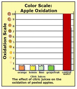
Your experiment is over and data has been collected. You now want to study your data results and make comparisons between the independent variable and the dependent variable. For the example project, a color scale can be created in order to have quantitative information to describe the results.
The color scale is an example that I created using the program called Snagit!. This program allows me to create the chart and different colored dots.
Note: The scale shown doesn’t indicate units. Instead, it is a color scale from 0 to 10 that indicates degree of oxidation. Since the oxidation of a peeled apple causes the exposed flesh of the fruit to turn brown, a color value of zero “0” indicates no oxidation, and a color value of 10 is the greatest amount of oxidation that the scale measures.
Yes, I created the color scale so that I would have a quantitative value for oxidation. Yes, you can create your own color scaled and yes it is scientifically valid as long as you show your scale with your data analysis. I did not invent the oxidation colors. I just created a number scale that is used to indicate the degree of oxidation, with the darker more oxidized color represented by higher numbers.
In creating my oxidation color scale, I started with the color of the apple flesh before being oxidized (color when peel is first removed. The color of the greatest oxidation would be the control (water) which is the darkest brown. I then, tried to create a color scale that increased in darkness with each higher number. There are no units on the oxidation scale because it is a comparison and not exact measurements.
Send comments and suggestions to ASK JANICE
RETURN TO SCIENCE FAIR PROJECT TEACHING TIPS for the next step
 |
Janice VanCleave’s Guide to More of the Best Science Fair Projects |

